Small tweaks, big results: accelerating open banking conversion rates

We recognise how important it is to optimise the performance of open banking flows. Any friction, bad UX, or lack of trust during the flow will lead to a higher drop-off rate than anyone should accept. And to ensure that Tink customers achieve high conversion rates, our team has been working tirelessly to create the best user experiences when using Tink products. From halving the time it takes to complete a payment to clarifying how we handle user data, we have been tweaking our products to encourage significant increases in the overall end-to-end conversion rates.
Open banking flows. What are they?
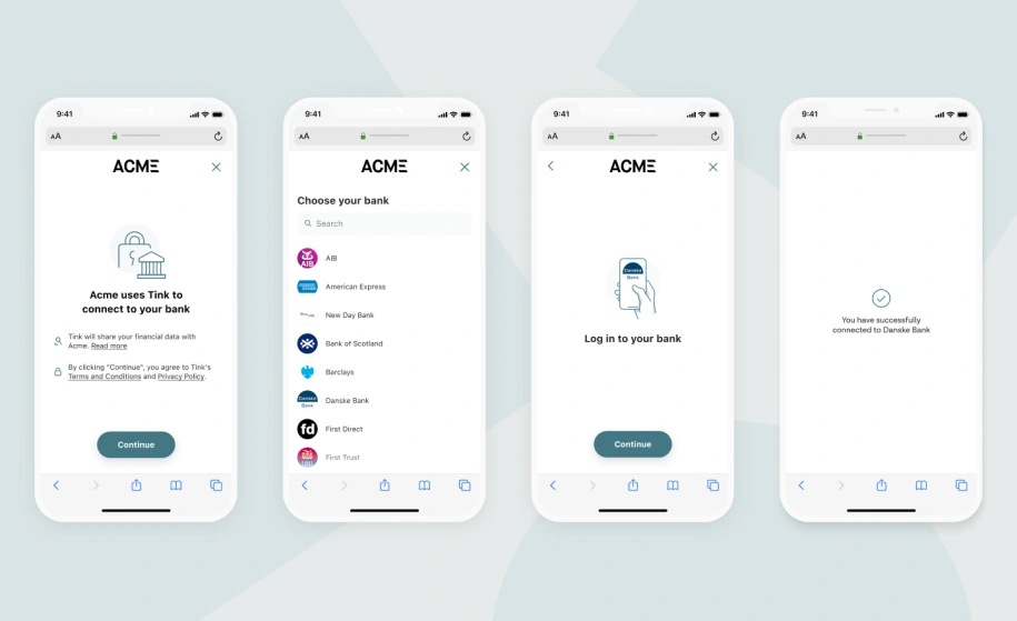
If you're new to open banking, let's first clarify a flow. A flow is when a user takes a series of steps to complete an open banking journey, such as making a payment or proving account ownership. It can broadly be broken down into the following steps:
Consent. Ask the user for permission to access their account and explain what will happen next.
Select bank. Prompt the user to pick their bank from a list of banks.
Authenticate. Depending on the bank, market and many other conditions, the user is taken to the appropriate authentication method.
Success. The definition of success differs depending on the product and use case. For PIS (payment initiation services), it’s usually a payment confirmation, while for AIS (account information service) products, it’s usually to confirm that the data has been aggregated successfully.
Fine-tuning Tink’s flows
So, why have users of Tink products recently seen an increase in conversion rates? In collaboration with a selection of clients, we have taken on initiatives to discover which improvements really benefit the user flow. Below, we will highlight some of the most impactful changes identified as inspiration for your own flows.
Cutting the duration of payment flows by half with one SCA
For those not in the know, SCA stands for Strong Customer Authentication – a regulatory requirement to reduce fraud and make electronic payments more secure in the UK and EU. Unauthorised card fraud is a serious issue, and with open banking and PSD2 enabling access to data and integration of payments, addressing fraud is important to protect financial institutions, merchants and consumers alike.
However, this well-intentioned security principle can sometimes create unnecessary friction for the end user. In some countries, users are asked to go through two SCA steps in a flow every time they make an open banking payment. In most cases, this is a technical constraint, and by storing the user's source account, we can remove the need for the user to authenticate twice and reduce the length of the flow by half. It may sound like an obvious improvement to make, but it’s also surprisingly technically complex and requires a lot of work from our teams to make it possible.
The following user journey visualises how the account aggregation step is executed in the background without needing authentication, with the user now skipping half the number of screens in the process.
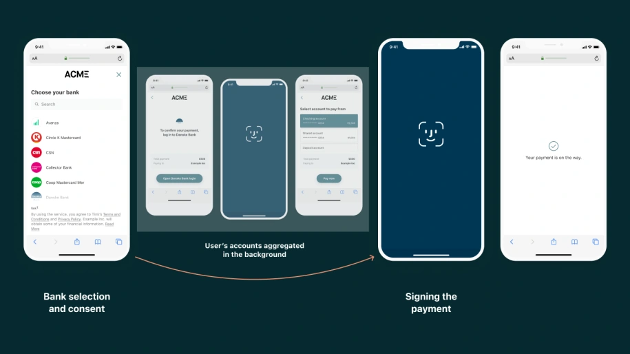
An example of a refined flow with just 1SCA
You can explore this further for both the AIS and PIS flows in the Tink Docs here. Please check with your Tink representative on market availability.
Easing the authentication headache
One upcoming feature we’re really excited about is the ability for Tink customers to offer a smoother open banking experience directly in their mobile apps.
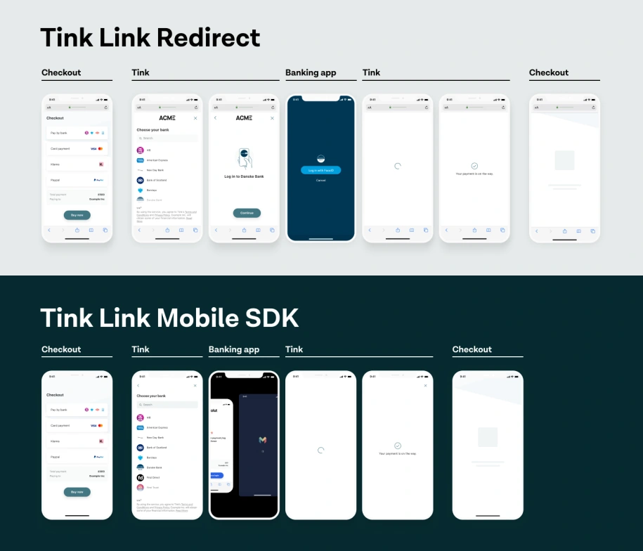
Why do users currently have to leave an app to make a payment, for example? It’s all for the purpose of authentication – the process of verifying the identity of a user and their ability to access a particular account. Traditionally, ASPSPs (Account Servicing Payment Service Providers) use a ‘redirect flow’ that takes a user to their banking app to authenticate before returning the user to the original destination.
This type of open banking flow causes friction for mobile users when having to juggle multiple apps. Enter Tink’s new Mobile SDK, our recommended integration method when launching open banking services within a mobile app. Not only do Mobile SDKs provide a tighter integration, they result in fewer screens and a streamlined no-click experience when redirecting to and from the bank app.
Making consent work for everyone
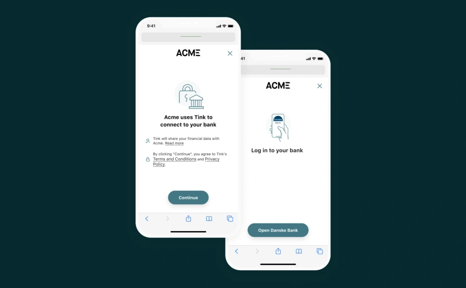
When handling sensitive data, particularly financial data, users have every right to be cautious about how they share it. Infrastructure providers such as Tink aren’t widely known to consumers, nor should they be, so we set out to find a way to increase transparency and clarify exactly how we handle user data before starting a flow. The image below shows how we currently display consent text to the user.
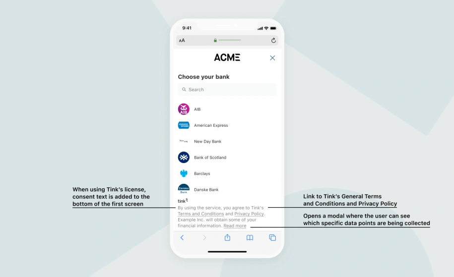
As explained above, we added the terms and conditions to the bottom of the screen to keep the flow short. However, by asking for consent in a subtle, unobtrusive way, we missed the chance to get the end user to truly understand what they were agreeing to.
Brushing over these details didn’t feel right, so our team decided to add a new screen that communicates what’s most important for the user to know clearly and concisely. Initially, there were some detractors to this approach because conventional wisdom says that we need to make our flows as short as possible. But the redesigned screens converted better, and validated our hypothesis that being transparent with the end user is only good for all parties involved.
And we didn’t stop there. We are now implementing product-led consent screens, tailoring legal information to the specific flow the user is completing. The below image shows how this might look for our AIS, PIS and risk decisioning services.
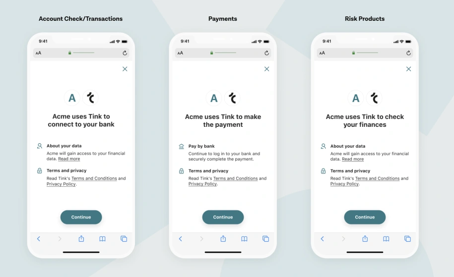
A significant benefit of this approach is being very specific and transparent about the kind of data Tink processes and why. Each product collects and uses variations of customer data, therefore these updated consent screens ensure end users know exactly how their data is used.
And finally, it’s much easier on the eye – there has been a big improvement to the visual design of the Tink user journey. Customisation features are to follow so customers can edit consent screens to meet their brand, further enhancing customer trust.
Getting the most of your users’ time
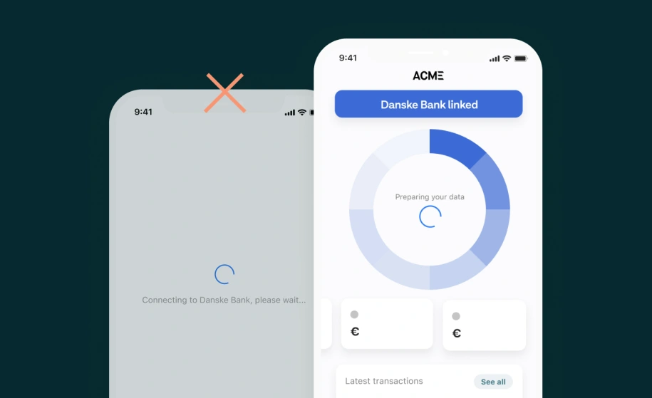
Depending on your action, some requests take longer to produce results than others. Let's say you're fetching several years' transaction history for your users – a task that could take up a few frustration-filled minutes for the user. You can make waiting for results a thing of the past through the ‘Early redirect’ feature, which enables data processing in the background and allows the user to exit the Tink flow as soon as they have given their consent.
This approach provides the opportunity to make the most of your users’ time, which could be used to perform additional actions whilst data is being collected in the background.
The power of search
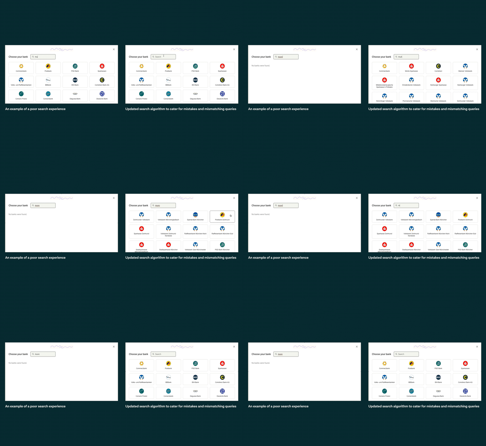
You will likely have experienced a search bar that didn't return the desired results after entering a query. A poor search experience can be a source of frustration for users, leading to some abandoning the flow for alternative means.
When analysing search queries through the Tink platform, it became clear that if a user entered a search with a trailing space (such as 'Revolut '), if there was a spelling mistake (e.g. 'Barlcays'), or if the search didn’t match the provider exactly (e.g. 'sparda hessen' instead of 'Sparda-Bank Hessen'), no search results were returned.
Typos and shortcuts are inevitable, so Tink engineers have upgraded the search algorithm to cater for mistakes or mismatching queries. It is estimated that a whopping 26% of searchers who couldn’t find their bank would now be successful, increasing overall conversions in the search phase by an additional 5%. This small tweak alone plays a huge part in hitting conversion rate goals and building trust among users in choosing open banking flows in the future.
Why UX matters
User experience (UX) is the term that defines how a user feels when using a product or service. A strong UX helps to build trust, develops long-term relationships with users, and fulfils the users’ needs.
According to Forrester, a well-designed UX could boost conversion rates up to 400%. These numbers are astronomical; whether this stat is true for open banking flows or not, a poor UX will undoubtedly hinder the user journey.
One recent UX initiative that has proven successful is adopting the same input fields as a provider's website or app to make it easier for users to understand what credentials they should enter. Alongside Tink client Deutsche Bank, tweaks have been made in the Tink flow to replicate the UX of their login page. By splitting the branch and account number into two fields in the login screen, just as it is in Deutsche Bank’s own channel, they have experienced a 10% increase in end-to-end conversion rates and a considerable decrease of 17 seconds in the flow duration.
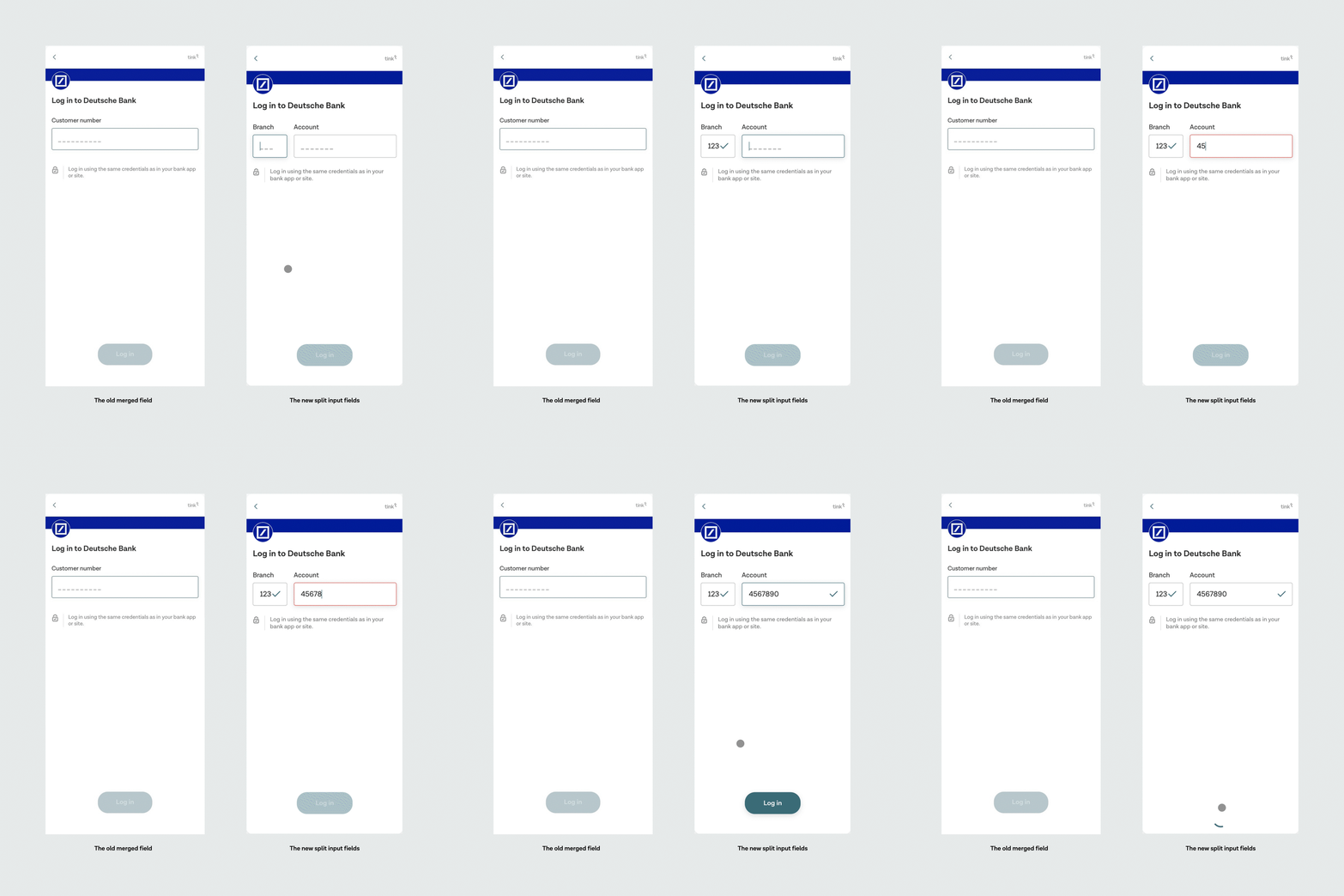
This simple but effective implementation shows how crucial UX can be in raising conversion rates.
For more UX inspiration, dive deeper into our Product Design team’s handy Tink UX guide - a curated collection of learnings and experiments performed together with Tink’s customers.
So what’s next?
The work goes on. Increasing conversion rates is a continual process and will be something we are always looking to improve.
At the time of writing, our teams are looking into the most effective methods of increasing successful first-time captures, and digging into comparisons between Android and iOS performances to identify what can be improved.
To provide complete white-label authentication journeys, it will soon be possible to customise URL domains which remove references to Tink in the browser address bar. User flows will be tailored to an even greater extent, allowing flexibility when aligning logos and adding navigation functionalities, to name a few examples. Custom typography will soon become available, offering unique titles, fonts and text styling matching your brand.
The lowest performance markets that we see today are getting special treatment to aid in bringing conversion rates up to the levels of their high-performing counterparts.
There’s plenty more to come in the not-too-distant future to ensure Tink consistently has the leading market conversion rates and is the most reliable choice for businesses looking to innovate through open banking.