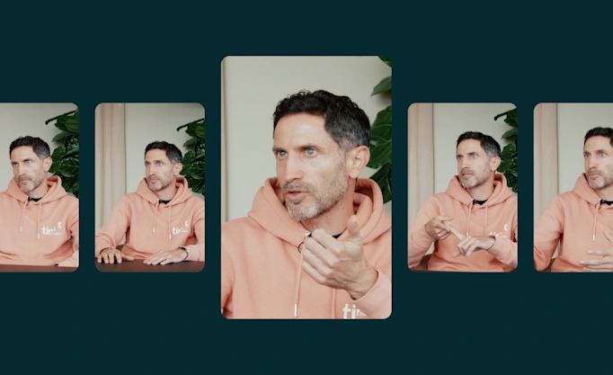
How to achieve the best possible Pay by Bank conversion rate

In this guide, our Payments team shares its best practices for optimising Pay by Bank user journeys and ensuring the highest possible conversion rate.
When paying online, users need to feel confident and secure at every step of the flow. The slightest friction can disrupt the user journey and bring down conversion rates. Fortunately, Pay by Bank offers businesses more flexibility and customisation options than other payment methods, letting you tailor the UX to your use case. Recently we outlined what a high-performing conversion rate looks like – in this post we describe the steps needed to achieve it.
How consumers perceive Pay by Bank
First, let’s bust one of the biggest myths around open banking payments – that consumers require extra education or incentives to adopt them. Consumers aren’t loyal to a payment method, they seek convenience and security and will choose whichever payment method offers both most clearly.
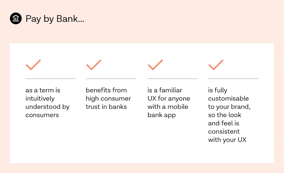
Tink’s recent consumer research showed that Pay by Bank has a head start here. It benefits from associations with the user’s bank – consumer trust in banks remains high – and that most consumers are already familiar with bank payments as a concept. In fact, 12% of 18-34 year olds in the UK say they’ve already used Pay by Bank.

How a typical flow looks


Clicking to pay by bank immediately starts the Tink flow
Know your customer’s use case
Optimising your UX starts with understanding the user. Several factors affect the likelihood of a user completing your flow – understanding them helps in building customer empathy and more relevant, personalised experiences.
Use case and motivation
A user’s use case is the underlying reason for using your service – their ‘jobs-to-be-done’ – such as buying an airline ticket or paying an invoice. Conversion rates vary by use case because the user’s motivation is different. Someone repaying a loan on time may have a higher intent to pay than someone buying a pair of shoes, resulting in different user behaviours. You should design your UX with this in mind.
Frequency of use (one-time or recurring)
The user’s level of familiarity with your service and how often they use it are key factors. A user might top up their digital wallet every week but top up an investment account once per year or so. First-time or infrequent users likely require more education and assurance than regular users.
It’s important to tailor the information you require from a user with this in mind. You can preselect a returning user’s bank, for example, letting them skip unnecessary steps. More on this below.
Key takeaways:
Use qualitative data (user interviews, surveys, feedback) and quantitative data (usage data, profile data) to build a customer profile
Consider creating user personas to structure your insights
Segment your user base according to frequency of use and other key factors, tailoring the experience if possible
Optimise the user journey
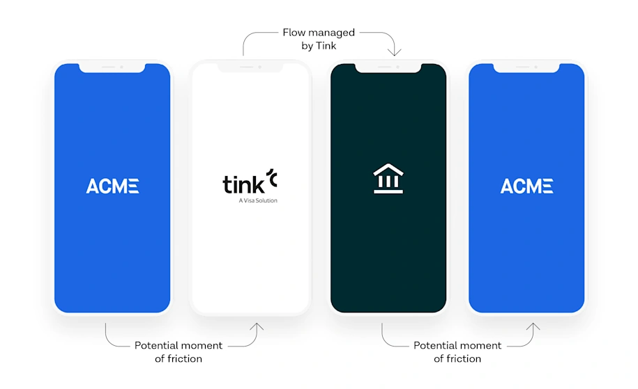
The best performing integrations with Tink are smooth and coherent. There are a number of ways to optimise your journey to remove any potential inconvenience or unnecessary step for the end-user.
Avoid unnecessary content
Generally, more steps in a user journey means more time and effort. All content should have a clear purpose, and screens that say the same thing twice can create friction. For example, we sometimes see customer flows that repeat consent or compliance text from Tink screens. It’s good to be transparent with users, but overdoing it can cause ambiguity and confusion.
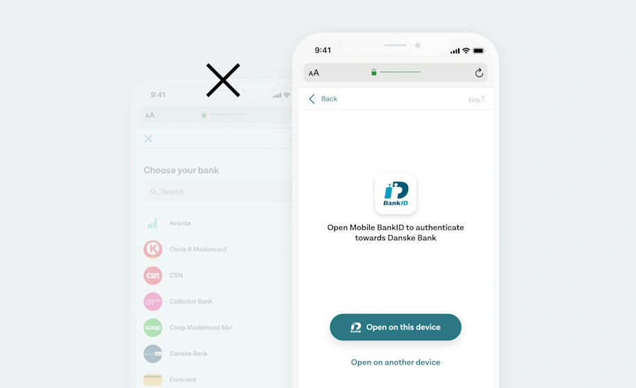
Merge steps together
Grouping steps into relevant sections helps keep the navigation clean and focused. For example, when hosting the bank selection step in your own app you can ask the user to select their bank on the same screen as where they selected Pay by Bank as their payment method.
If you’re using your own licence, you can also insert the consent step at any stage of the user journey (pre-authentication), even in your own app, so there’s no need for an extra screen.

If you use your own licence, users can provide their consent on any screen prior to entering the Tink flow.
Skip steps
The best-performing flows avoid asking users the same things more than once and allow certain users to skip ahead. This is especially relevant if people will use your product on a recurring basis.
When preselecting the user’s bank you can skip the bank selection screen entirely.
When a user selects their bank and source account for the first time, or if you already have them on file, you can preselect both the user’s bank and source account the next time they enter the flow. This lets you pre-populate the user’s preferred payment method so they can skip these steps altogether.
Pre-fill information
Similar to pre-selecting a user’s bank, you can also prefill user information if you already have access to their credentials. In some countries, when a user authenticates they’ll need to provide information like a social security number to identify themselves. Pre-filling this saves the user time and effort.

If you have user credentials stored, you can prefill fields such as their social security number.
Enable desktop-to-mobile handoff
In some countries, like the UK, users that start the flow on desktop can easily switch to their mobile banking app for authentication. This feature is pre-enabled wherever banks support app-to-app redirects, and usually results in significant conversion increases.
Key takeaways:
Avoid duplicating content from Tink’s flow in your own
Merge steps to shorten the flow, but don’t make any one screen too busy or confusing
Use shortcuts, like preselecting bank and source accounts and prefilling user information
Choose the right Tink Link SDK for your use case
Make an informed decision about whose licence you’ll use – in most cases we strongly recommend using Tink’s licence
Communicate clearly to users
Next to optimising the user interface, communicating the right message at the right time is key to a great UX. Your aim is to help the user understand what they’re being asked to do in order to achieve their goal. Too much content can frustrate a user, especially if they’re intent to pay is high. Too little, and a user may not feel sufficiently informed or secure.
Prepare your users for Tink
A key factor in how your integration performs comes down to how well prepared users are before they enter an open banking flow. This means clearly communicating to the user what they’re being asked to do and what they should expect.
Our UX guide covers the importance of preparing users for Tink in some detail. In a payments context, there are a few additional things to bear in mind:
Pre-inform users: When adding a new payment method to your app, it may make sense to notify users in advance or add a ‘new’ badge to your checkout screen.
Help first-time users: First-time and occasional users may require more guidance. One option is to introduce ‘positive friction’ – an extra message or screen that informs the user without overdoing it.
Avoid focusing on Tink: our research shows that users intuitively understand what ‘Pay by Bank’ means and don’t need Tink’s role explained to them beyond what’s in our standard consent text.

Mentions of Tink, PSD2, and other technical information can easily confuse users.
Be transparent
Before users are redirected to Tink, our tip is to clearly but concisely explain what information they’ll share with us. Good examples of this follow the principle of progressive disclosure, presenting the most important information a user needs to know at first with the option (like a drop-down box) to learn more.
Be contextual
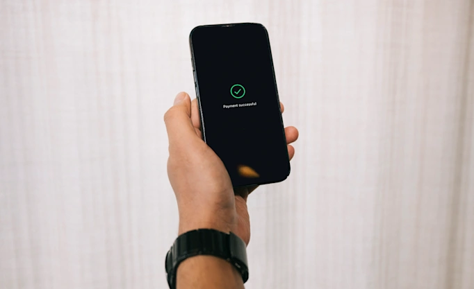
Contextual messaging helps users understand where they are in the journey and next steps. Take success and error states, for example. Once a user has made a payment, let them know it was successful by showing a payment receipt or summary. When something goes wrong, you can use error codes to let the user know what happened and what to do next.
Such messaging is also useful when validating user data in real time, using payment conditions. This can prevent inaccurate information from causing payments to fail unnecessarily. And if you expect users to pay or transfer large sums of money, we advise providing clear amount limits.
Key takeaways:
Briefly explain to the user what they’re being asked to do, especially if it’s their first time
Give your payment method a clear, relatable name (like Pay by Bank)
Use contextual messages and success and error states to guide users through the journey
Create a consistent look and feel
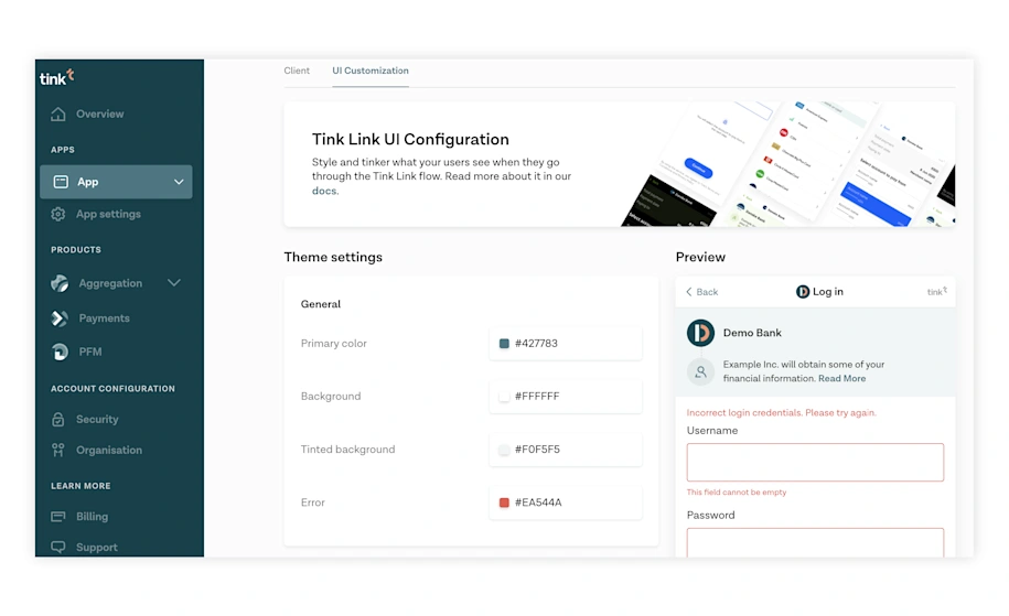
One of Pay by Bank’s key benefits is the extent to which the flow can be customised, including colours, typography, and logo. Tink’s solution is designed to be fully white-label, with Tink’s brand firmly in the background and your brand front and centre.
Customise the branding
To ensure a seamless transition between your product and the Tink flow, we recommend using consistent colours and fonts and adding your logo. Refer to this article for more in-depth information.
Key takeaways:
Create consistency by customising the branding of your flow inside Tink Console
Additional options are available for enterprise customers using their own licence (see this article)
Test and iterate
You’ve designed and built the user journey and now it’s ready to launch, right? Not quite. Our best-performing customer flows are validated with test providers, tested internally with employees, and rolled out gradually to select user cohorts.
Validate with test providers
Before testing your flow with real users, you need to validate that it works. Tink has configured test providers across multiple countries to help you simulate the user journey and recreate different scenarios and edge cases.
Adopt a test-and-learn approach
When planning your rollout, include time for internal testing and expand the audience gradually, iterating as you go. The most successful roll-outs are tested in one market first with a select group of users, and then expanded to more countries and users.
There are few hard and fast rules when it comes to UX design – it’s important to use A/B tests to inform your decisions. In this post we cover what kind of conversion rate you should be aiming for and the metrics to track to help you get there. We work closely with our partners before, during, and after the roll-out phase to test and optimise their integrations.
Key takeaways:
Validate the flow with test providers and colleagues before testing with real users
Roll out your new flow gradually, gathering user feedback and iterating
Some markets have more mature open banking flows than others — a gradual, case-by-case rollout can help solve for local nuances
UX checklist
Understand your users, their use case, and motivation (user personas are a good start)
Design different flows for first-time and returning users
Customise the branding
Remove unnecessary content and screens
Account for success and error states in your design
Prepare your users before redirecting them
Save previous user choices
Test with colleagues and real users, gather feedback
Plan a staged roll-out to select user cohorts
More in Open banking

2025-11-20
3 min read
Tink powers the UK’s first cVRP transaction with Visa A2A
In partnership with Visa, Kroo Bank, and Utilita, we’ve just helped demonstrate the UK’s first commercial variable recurring payment (cVRP) using the Visa A2A solution – and it’s a big step forward for how people make regular payments.
Read more
2025-06-09
11 min read
The case for “Pay by Bank” as a global term
Thomas Gmelch argues that "Pay by Bank" should be adopted as a standard term for open banking-powered account-to-account payments to reduce confusion, build trust, and boost adoption across the industry.
Read more
2025-06-02
3 min read
Tink joins Visa A2A – what it means for Pay by Bank and VRP
Visa A2A brings an enhanced framework to Pay by Bank and variable recurring payments (VRP) in the UK, and Tink is excited to be one of the first members of this new solution.
Read more
Get started with Tink
Contact our team to learn more about what we can help you build – or create an account to get started right away.